Lorem ipsum dolor sit amet, consectetur adipiscing elit. Ut maximus rhoncus dui ac tincidunt. Sed sagittis, mi tempus sagittis euismod, arcu lectus faucibus nulla, vel feugiat diam ipsum sed tortor. Nam congue metus quis turpis iaculis, ut tempus dui vulputate. Curabitur mollis sem augue, vitae tincidunt turpis dignissim eu. In efficitur finibus velit sed sodales. Fusce ut nibh quis justo mattis sollicitudin nec molestie metus.
![]()
CLEAR ZONE
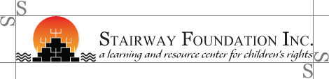
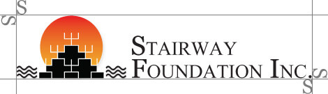
To ensure that our logo is clearly visible, surround them with the clear space shown below – free of type, graphics, and other elements that might cause visual clutter – to maximize the recognition and impact of our identity.
Logo with slogan
Logo without slogan
ALIGNMENT
Bottom-align the logotype to the descenders of the text with the symbol. Left align the left-most ascenders of the logotype with each other.
![]()
BACKGROUNDS
Our logos should sit on one of these three background colors.
LOGO ALTERATIONS
To maintain the integrity of the Stairway logo, and to promote the consistency of the brand, it is important to use the logo as described in these guidelines. The logo cannot be altered or redrawn in any other way. The examples shown here illustrate misuses of the Stairway logo that should be avoided.
DON’T use colors inconsistent with brand standards
DON’T replace typeface or change character case
DON’T distort. stretch or add effects to the logo
DON’T rotate logo
MINIMUM SIZE
To preserve legibility, the logo should never be smaller that 1″ in height and should never appear at less than 72px in digital formats
![]()